Module gallery
Every page module in the design system and each of its presets. Editors pick these presets from the module picker in the CMS, then edit the copy.

Section header plus a 3-column bento grid of 4–6 cards in mixed sizes.
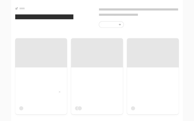
The latest posts from the blog, as cards, a list or a featured story.

A closing call to action: centered, split, in a card, or with copyable terminal commands.
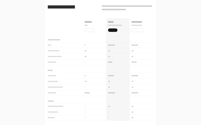
Compare plans or products feature by feature, with rows grouped into categories.
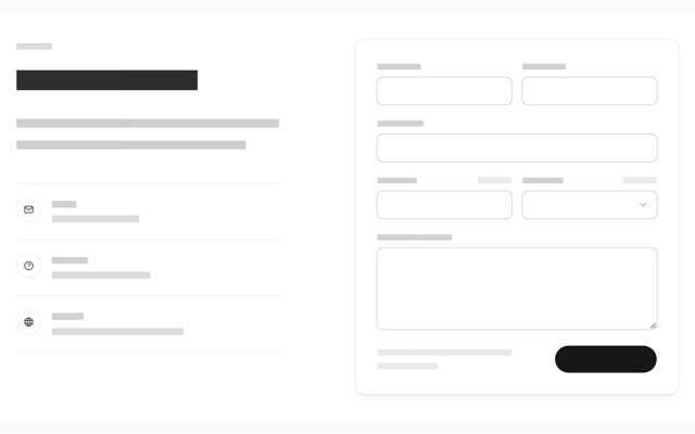
Title, body and contact methods on the left; a configurable form card on the right.
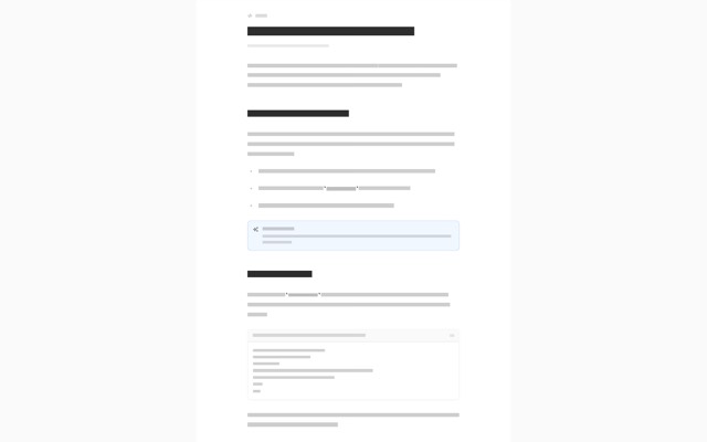
Long-form rich text (articles, legal pages, docs) with an optional title and sticky sidebar layout.

Vertical space between modules, optionally with a hairline.
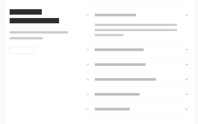
Frequently asked questions as an accordion, with the title beside it or centered above.
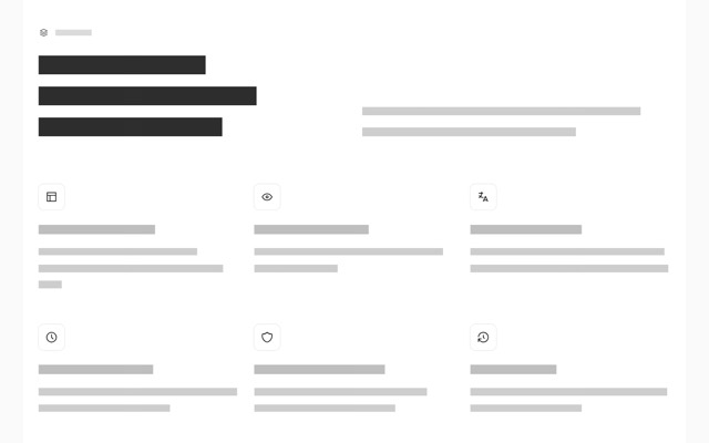
Section header followed by a 2, 3 or 4 column grid of features with icons.
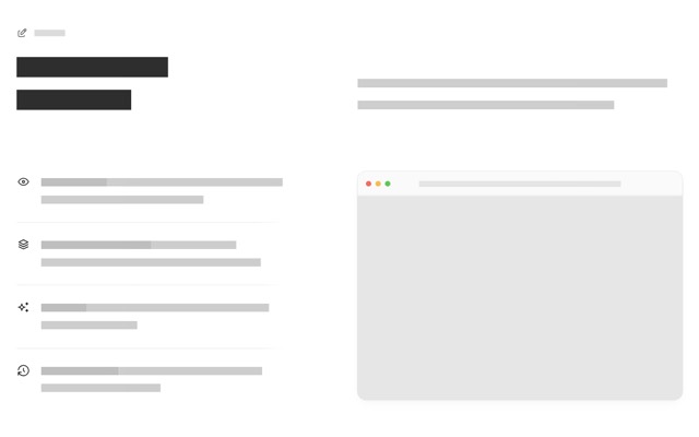
Section header, then a checklist of features beside an image, screenshot or code sample.
Embeds a reusable section from the Global Modules collection. Edit it once, update it everywhere.
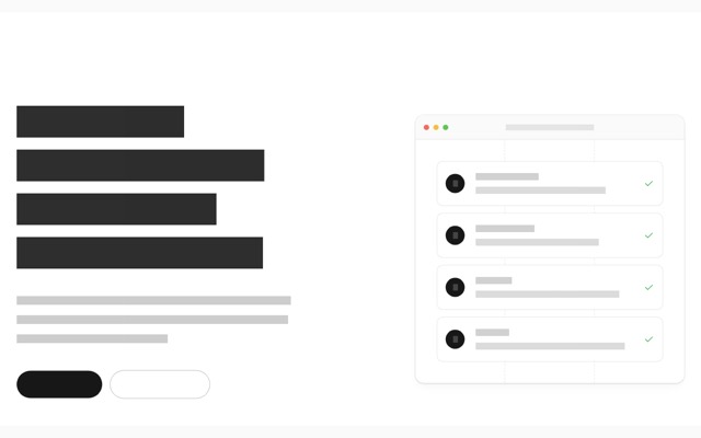
Page-opening headline with CTAs and an optional visual (image, code or step list).

"Trusted by" wall of customer logos: inline row, centered grid or hairline grid.
A large image, screenshot in a browser window or YouTube video, with an optional caption.
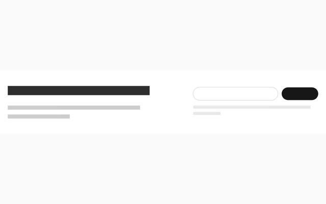
Email signup form with title, body and fine print. Inline split, centered or in a card.
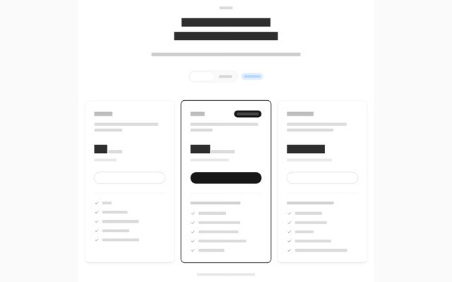
Two to four pricing tiers with features, an optional highlighted plan and a monthly/annual toggle.
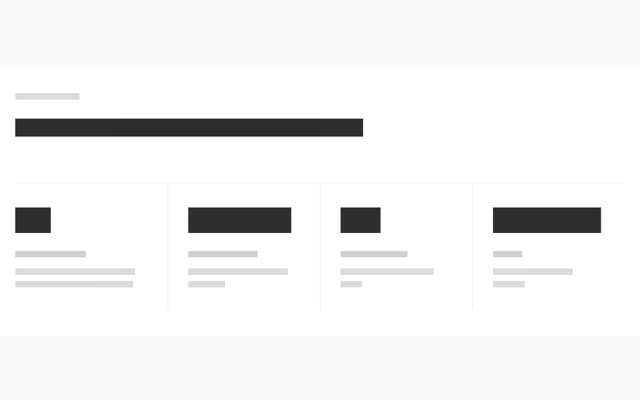
Big numbers with labels: a divided row, cards, or header left with a 2×2 grid right.
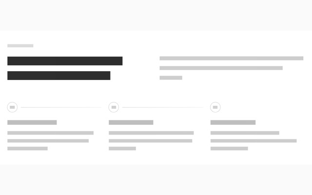
Numbered "How it works" steps, side by side or as a vertical timeline with code or images.
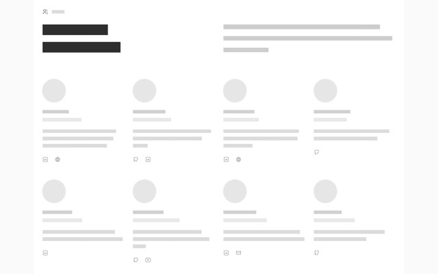
People with photo, name, role, bio and social links, as a grid or list.
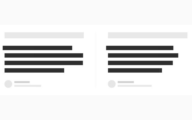
Customer quotes: a side-by-side pair, a grid of cards or a single large quote.
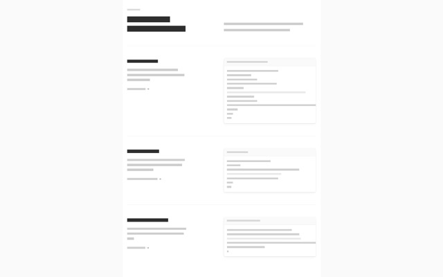
Section header, then rows of use cases: copy on the left, a code sample or image on the right.